
6 Easy Ways to Use Visual Hierarchy in your Designs
Visual hierarchy is an essential idea in any designer’s arsenal. Careful application of the technique can change a confused graphic to a solid design with purpose. Like color theory, visual hierarchy can be used to set the tone of the design and create movement in a picture.
With various concepts that can help alter visual hierarchy, such as contrast, color, typeface, direction and PosterMyWall’s design tools, you’ll be set on your journey to a better design experience in no time.
We recommend new designers and experienced designers alike to read on, as there is something new for everyone.
What is Visual Hierarchy?
Visual Hierarchy is based of Gestalt Psychology, which was first called so in the Berlin University of Experimental Psychology. It is revolutionary in theory as it is now useful practically.
Visual Hierarchy is based on the assumption (taken from Gestalt Psychology) that the human mind seeks to create order in everything it sees. This means that anything, when seen as a complete picture is not necessarily the sum of its elements. It is essentially an entity independent of its parts.
That doesn’t mean the parts have no influence on the complete design. They do, and that is what visual hierarchy sets out to do. To influence how a design is perceived by one’s audience through a wide range of design techniques.
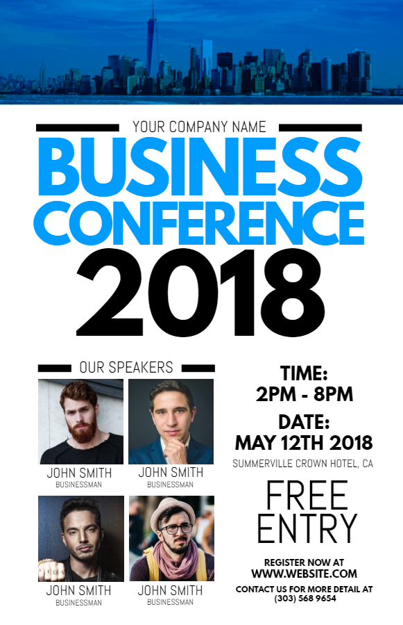
Size and Font
A good font gives your text a personality. When skimming through designs separated by categories, this becomes even more evident. Cursive fonts are flamboyant, beautiful and feminine. They look great in elegant menus, fashion magazines and some some party invitations.
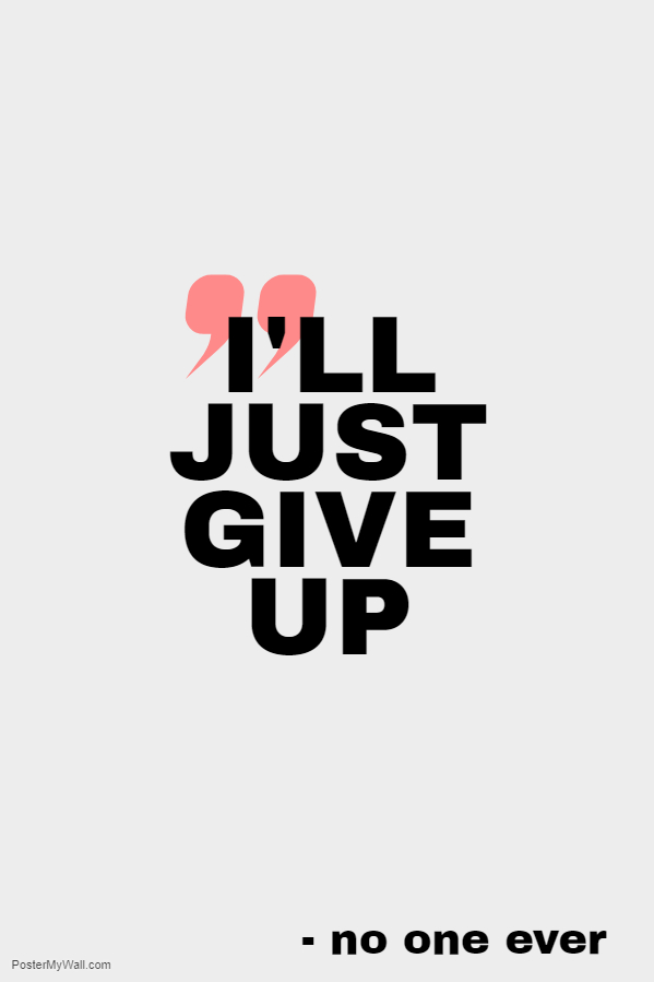
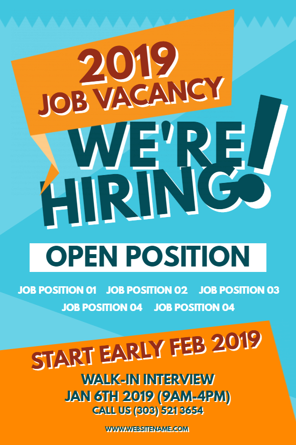
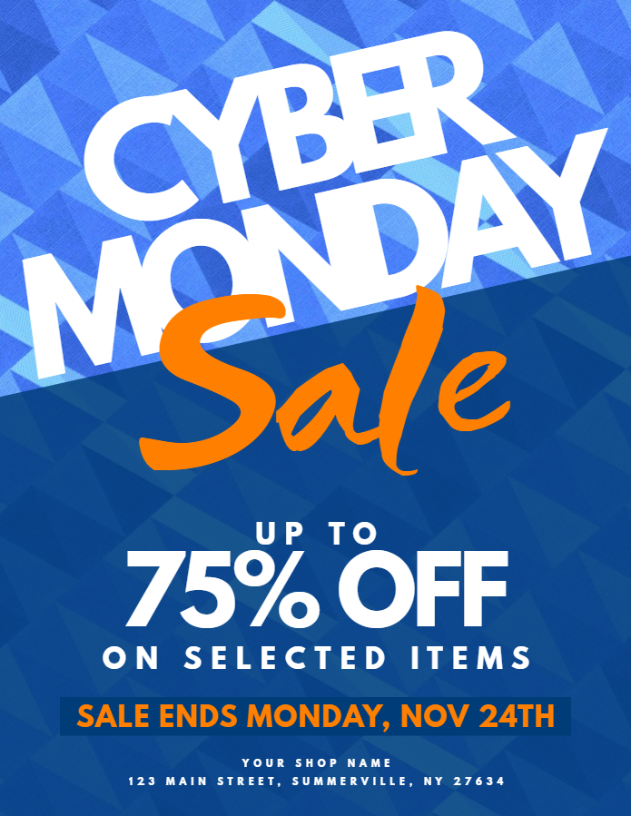
A large and bold font has a personality that is quite contrary to cursive font. It demands attention, and this increases with size. Bold fonts lose the stylistic element for greater functionality. Flyer headers and important announcements use bold fonts and it is a favorite for retailers for its ability to capture one’s gaze. Couple this with the color red (discussed later), and you have a perfect match.
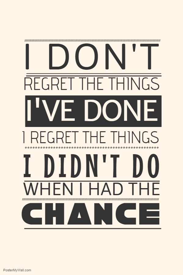
And then there are simpler, serif and sans serif fonts. They demand little, though they would like your attention, but demand it less forcefully then a bold, larger font. They can be boring or they can be dominant, depending on their position in the hierarchy. Sans serif and serif are the most commonly used because of this one function. They are flexible and are suitable for headers, sub-headers and the main body of text for flyers and posters.
But size can shift the dichotomy of dominance and sub-ordinance, established by fonts greatly. A cursive font can be just as imposing as a more basic font, if it’s size is increased. A bold font could appear secondary, if the font size is small, or it has a cool color, or both.
Contrasting Colors
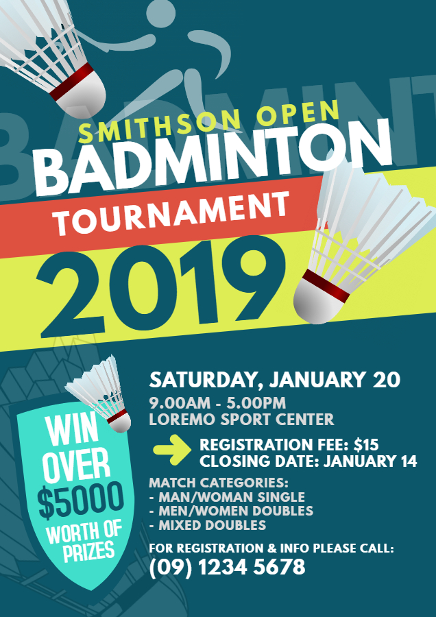
Opposites attract. This is even more true with colors. Artists from time immemorial have harnessed the power of colors to move their audience in ways otherwise impossible. More recently, color combinations in advertising are carefully engineered to influence the attention of users. Warm colors (red, orange and yellow) attract attention, neutral colors less (brown, black and white) and cold colors even less (blue, some shades of green).
Which of the posters caught your attention first?
If it’s the one on the right, well, Gestalt psychologists would like to have a word with you!
Create contrast by combining warm and cold colors for exciting new combinations. These combinations give you control over your audience through your poster by directing their vision to the warm portion, (which presumably is the important part) and then the rest of the poster acts secondary or as negative space.
Color Temperature
We’ve discussed warm and cold colors, and mixing them together. More often than not, you’ll not want to mix the colors, instead create a design that looks homogeneous but still vibrant. Here’s where mixing warm or cold colors with neutral colors can produce results.
For the above designs, some of the emphasis as present in the previous designs is traded in for a more unified look, with all elements attracting with varying degrees of attention.
Movement in a Picture
Pictures are static, if we’re being perfectly serious about it. That doesn’t mean you can’t direct the viewer’s vision to move for you. Creating movement in a design makes it natural and pleasant to the eye. It creates emphasis in places where there isn’t any normally.

This live music design brings out the best in the design, using diagonal movement, light strokes and shapes. It keeps the eyes curious, and on the move.

Design this on the brochure maker.
Here we come to another crucial point. When viewing a block of text, where do you start first? From the left side probably. As the English language goes from left to right. Therefore it is also true that designs are viewed in the same fashion. From left to right. The brochure above plays with this tendency. At first, it naturally directs you to the right, then left, then right again. Before you know it, you’ve zigzagged your way through the whole brochure!
Negative Space in Designs
Misunderstood, and sometimes even disliked, negative space is one such element, that is avoided by many designers, but as any great designer will tell you, it can be harnessed to bring out the best in any design.

How, you may is ask is this possible? It’s human psychology. The more elements scattered across your design, the greater one’s attention is divided, as one scans through every individual elements, often times bypassing important information.
With good use of negative space, by adding only that which is necessary, an illustration, a product photo, a header or a price list, your viewers will have their undivided attention on that particular element.

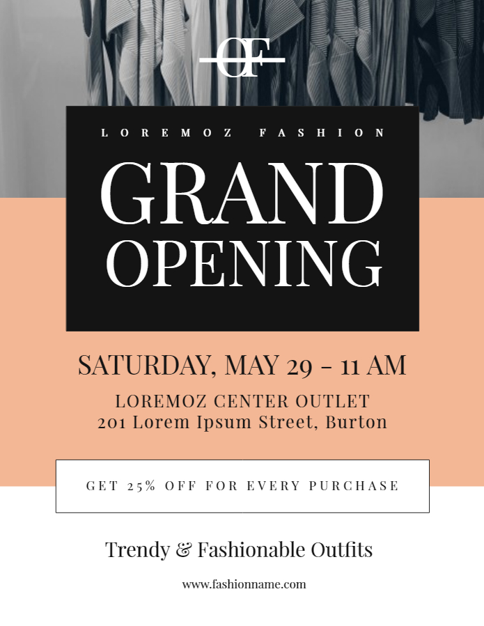
This use of negative space should not be equated to a design having a minimalist look. Not at all! Efficient use of the design canvas is all there is to it. The red and white contrast between the "Donate Blood" text creates greater emphasis for the header, keeping it at the top of the hierarchy. This creates an obvious and neat hierarchy.

So snuff out some of that noise and try a cleaner look!
Repetition For Creating Context

When done in small doses, repetition can do more then just save time. In a world where viewers are getting more impatient and ads are pulling all the stops to get their attention, context matters greatly.
This is because when the viewer skims through a web page, and sees the cupcakes in the design multiple times, he’ll come to a conclusion that the ad is about a bakery without even having a good look at it.
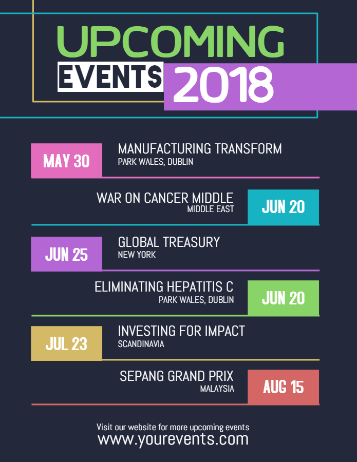
Similarly, the event schedule is easy to discern from others because of the repetition in the design, giving the viewers the information they need with a mere glance (that this is indeed, an event schedule).
Visual Hierarchy in a Nutshell
Visual Hierarchy comes down to 3 elements that make or break a design. These are an attractive image(s) to get one’s attention, the header to gain interest, and the body of text to pass information.
This three layer hierarchy forms the basis of all designs, and as seen above, you can meddle with them in subtle and fascinating ways to produce stunning designs that attract your audience.


