
Top 7 Typography Trends in Web Design Today
Web design trends are always changing. Design companies must stay on their toes to bring their clients the best there is on offer. Some of the new web design trends include dark mode, minimalism, and more leeway with creativity.
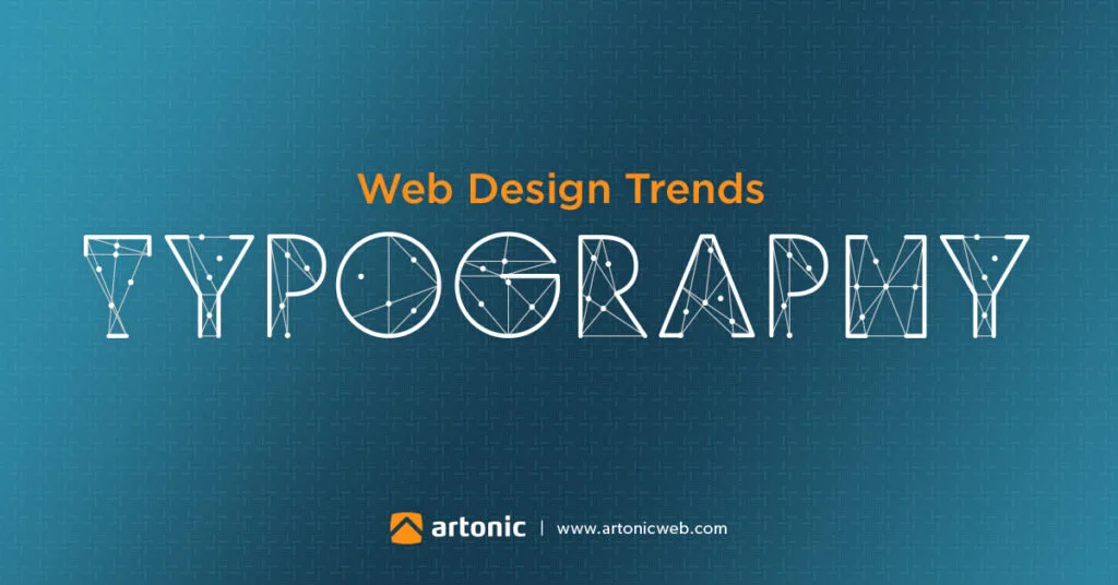
The same is happening in design typography. Typography is the arrangement of text in a way that creates visual impact. It takes into consideration font size, text length, line, and letter spacing.
In our article, we will look at top typography trends in web design today.
Size variations

A professional web design company applies size variations in web design. They are incorporating the use of different text sizes ranging from small to very large.
Large fonts are assertive and very powerful. Incorporating the use of the right images brings it out even more. The font size dominates the screen elements. It can go up to 85 points and above.
Design companies also incorporate the use of caps and bold strokes. It brings in an element of drama. It looks great on home pages.
Combine fonts with the right contrasting background, and the web design stands out. White fonts on a black background, for example, are loud, bold, and very attractive to look at.
Thin strokes also add a contrasting element for a more visually appealing look. It makes it easier to read the text from a distance. It is, however, essential to do it in moderation. Otherwise, you may end up overwhelming the web site.
Hand written and artistic fonts

Hand drawing or writing of fonts is catching on. The designer has leeway with regard to creativity.
You get a better expression of the designer's artistry. For a company website, it brings out a more human side.
You forego harsh lines that you will typically find on websites. It makes you more approachable because handwritten fonts are more welcoming. The trend will work well for smaller companies that are still in the stage of building relationships.
Artistic fonts allow for a high level of customization. Rein in the design team, though; too much creativity could compromise readability. Such fonts, however, look great on title or headlines. They should not dominate the page. Otherwise, your website may end up looking weird.
Decorative typography with serif

Serif fonts are fun and remove the rigidity some of the fonts have. Serif has strokes on each character that adds a decorative element. Designers now incorporate the use of thick strokes and spacing between the letters. Others will outline the letters for a more unique customized look.
You create emphasis while maintaining stylistic elements. It ensures readability without compromising on the aesthetic appeal. It also provides a fantastic way to differentiate certain elements within the website. Such could include keywords or titles that you want to stand out.
The rounding of the serif fonts is also catching on. It brings in a touch of modernism while maintaining minimalistic aspects.
Shape fluidity with dynamic lettering

You may have noticed some typography attempts to create an illusion of movement. Shading and action lines end up creating fluid shapes and forms. Think about it like looking at a snapshot in motion. You have the advantage of translating such lettering into animation.
Be careful, though; such lettering can be difficult to read. Use it conservatively in web design. You must also pay attention to how it translates on different screens. What may look fantastic on desktop could distort on mobile.
Text highlighting

On a typical website, you will find different behaviors. Some will read through the articles and content you have. Others will skim through it and only pick out what they want. Text highlighting works very well for the latter group as it helps them notice critical messaging.
Designers use colorful highlights for specific sections within the webpage. It allows for the creation of a content hierarchy depending on what you want audiences to take away with them.
Piling on the effects
Minimalists may disagree with the piling on the effects trends. However, it is a fun typographic style that is catching on. It allows web designers to be as creative as they wish. It includes bringing everything and anything on board for that unique web design.
You have leeway with regards to the use of color, fades, bevels, and shadows. Incorporating bold text, movement, and different textures can create some fantastic designs.
Some designers will make some of the individual letters more prominent. It could be playing around with the shape of a letter. Some 'misplace' some letters so that they're not in perfect alignment with the others. The one thing for sure is your visitors are likely to notice your website's design aspect.
The Use of Color in Fonts

Minimalism has, for a long time, resulted in the use of black and white typography. But now, the trend is shifting towards colorful minimalism. It allows for the use of different colors. The result is a more engaging, aesthetically appealing website. You can also use it to draw the attention of your website visitors to particular sections.
The advantage is you do not have restrictions on the colors you can use. It is, however, essential to pick your color palettes to reflect your brand. Moderation in application is also essential. Having too many colors can distract users from the messaging. You also lose the seriousness a professional website needs to be of use.
Final Thoughts
We have looked up the top typography trends in design today. Changing up your website’s typography can give it a fresh look and make you stand out from your competitors. Do not be afraid to experiment with some of the web design styles.
Pay attention to your brand and what you want to communicate with your audiences. It’s important to not go overboard by using complex typography and a cacophony of colors that may even ruin your website. Lastly, you need to make sure that your website typography does not distort depending on the device.
Play around with combining some of the techniques for a unique look. The professional web design company you up to work with should be able to advise accordingly.


