Simple Tips to Spice Up Your Social Media Promotions
Ever noticed there are some things you just can’t text without an emoji? Just look at the difference between these two statements:
I don’t know about you, but for me the first one strikes the “angry girlfriend” chord while the second could easily be flirtatious banter.
The power of visuals in digital communication just can’t be understated. Visuals are the medium with which you express the emotions of your brand, thus humanizing it one step further than written words ever could.
But you already understand that. What you might be struggling with is building enough content to make a big presence in a 24/constant social media-obsessed generation.
That’s where easy graphic tools come in. Apps like PosterMyWall are great for filling gaps and building engaging promotional content with creative, custom and visually striking images. Influencers online are using these graphics to promote events, inspire audiences, run special promotions and more.
To give you some ideas, check out how the following social influencers are using graphics and visuals in their content.
Band Tour Dates: MayDayParade
MayDayParade Band is a five piece band out of Tallahassee, Florida. Their Instagram feed is full of hardcore video clips, smoky stage photography and rock head-banging galore. They promote tour dates and nominations with custom graphics, like this one.
When creating your own poster, it’s all about artistic choices. You can create them in minutes with no actual photography…but they can go wrong pretty easily. Choose a background that matches your brand. Next, add your text and play around with the fonts until you find something equally readable and stylish (or simple, if that’s your style). If you’re going to be designing a lot of these (or a lot of any kinds of graphics with text), it’s worth it to get to know your fonts.
Here is a customizable, downloadable band flyer template that you can use to get started. Or browse our gallery of concert and band design templates.
Pro Tip: Pick a signature font that you will use most of the time throughout all branded graphics, posters, web design and more. Simple tricks like this will help your audience begin to immediately and subconsciously identify your brand when they come across anything you have designed.
Invitations: Kimberly Fisher
Kimberly Fisher is a socialite in LA who has paved quite the path of success in the blogging world. Her posts use class and style to promote good causes, beauty products and nightlife destinations.
In a recent blog, Kimberly raises awareness for a non-profit dedicated to helping homeless women by posting this invitation to drop off unused beauty products. Tools like PosterMyWall make it easy to put together professional posters like this.
Much like the MayDayParade poster, invites can be created simply, in minutes, with free stock photos or simple backgrounds. If the purpose of the graphic is to support a cause or another brand, you’ll need to make the choice whether to brand for YOUR blog/business or theirs.
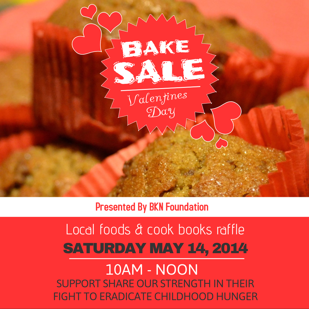
Here is a customizable, downloadable invitation template that you can use to get started. Or browse our gallery of fundraiser event design templates.
Pro Tip: Create two versions of this type of poster; One to be posted to your social channels and one for the collaborator. You have built a following that recognizes your branding, so they will be more likely to support if and when they immediately identify the cause with YOU.
Contest Promo: Lagunitas Beer
Lagunitas beer is a tried and true beer company that deserves its lofty 119k followers. They post random hilarious videos and brewing lifestyle photography with witty comments that are sure to get you ROFLing. When they run contests, they post custom graphics like this one.
Does this contest promo poster seem really complex? Check out how easy it is to do something like this with PosterMyWall. Here is a customizable, downloadable contest promo template that you can use to get started. Or browse our gallery of design templates for contests.
Pro Tip: Decide where your graphic will be posted before creating it. If it’s mainly for Instagram, you might make it a square, like Lagunitas Beer did.
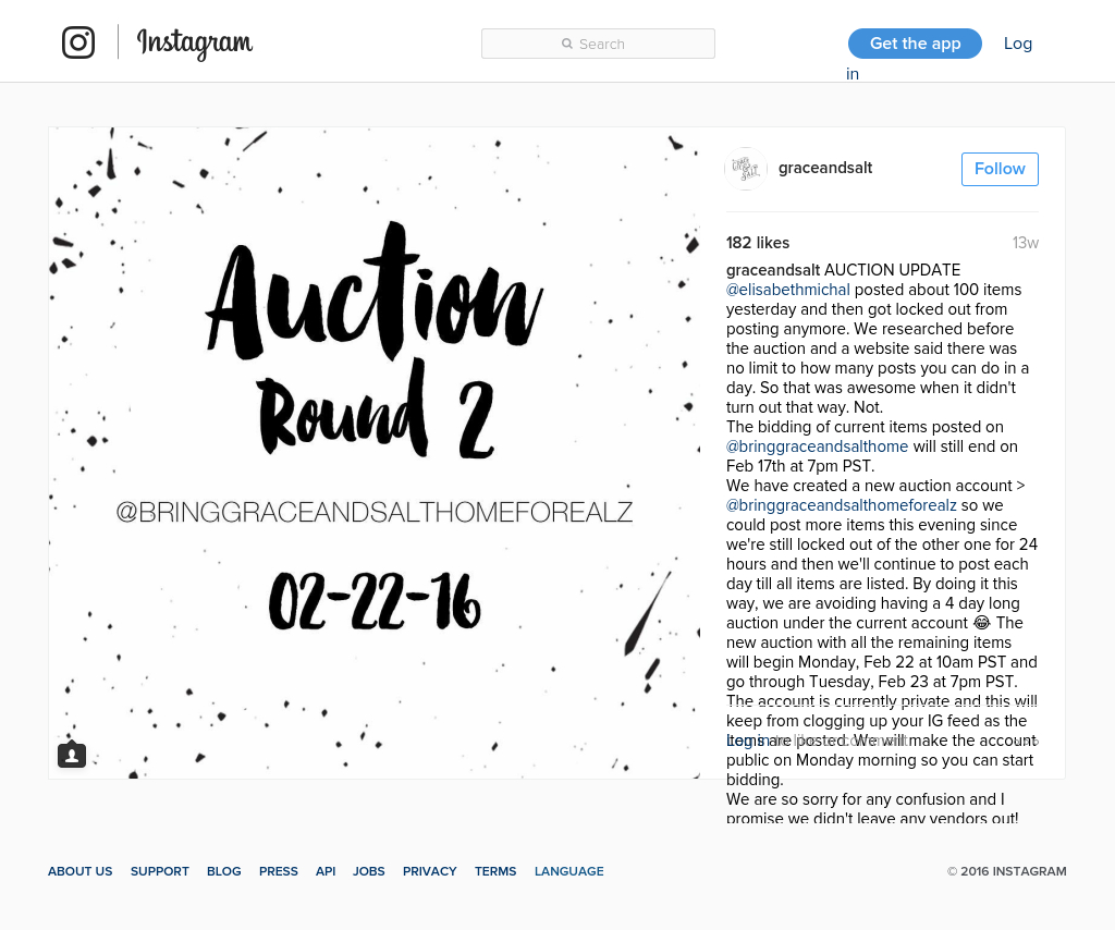
Auctions for a Cause: Grace & Salt
Justin and Keary of Grace & Salt have got to be one of the most inspiring “Pinterest Worthy” couples to follow. While their accounts were initially built to support their photography and woodworking business, the last year of G&S blogs has been describing their tiresome journey adopting two Ugandan children. While they were (literally) stuck in Uganda, their social team went to work to raise support and get them through the various trials they faced before bringing their beautiful babies home to the U.S.
Sometimes just a great font and a very simple background are enough! Notice that Justin and Keary’s team posted this to their own account but included a separate auction account created just for this purpose.
Here is a customizable, downloadable auction flyer template that you can use to get started. Or browse our gallery of event flyer and poster designs.
Pro Tip: For all you and I know, it could be Justin and Keary drumming up all of this support for their own cause. In other words, they may or may not have a “social team.” Either way, they come across as if they do. Treat your brand as if it is as big as you dream it will be. Even if you are your social team, it can make sense to talk about yourself in third person if you’re trying to raise support for your own cause.
Promotional Events: Bumble and Bumble
Bumble and Bumble is a posh hairdressing salon that uses visuals very naturally via simple images and text to run social promotions. Their work goes to show that even the best salon style pages don’t have to be the fanciest.
The key to creating a classy social promotion like this one is the photography. Choose a clean image of your product (or a stock photo to represent, if applicable). When you write the text, keep in mind that you want to keep it simple and raise curiosity. The bulk of the information should be in your caption. That’s how this image is different from an invitation, and it can be argued that this is a more natural approach on channels like Instagram or Facebook.
Use the same image and include the caption. Point an arrow to the information in the caption and annotate it. Point out both the invitation info (address) and special hashtag.
Pro Tip: Choose a hashtag for your event! Make sure you have a sign at the event that encourages guests to use it.
Here is a customizable, downloadable event flyer template that you can use to get started. Or browse all retail design templates.
Coupons: Miss Whoever You Are
Miss Whoever You Are has made quite the business out of her blog. In addition to her main beauty articles, she collabs with all kinds of brands and uses graphics like the one below to showcase sales and give her partners visibility.
This coupon is pretty much the opposite of what I’ve been sharing so far. Yes, your social followers appreciate you being a real person and posting things that look more like natural posts than straight marketing banners. However, there is a time and a place for classic looking ads and coupons.
If you need to create one, don’t be intimidated. Start by writing your text. Then make it shorter (trust me on this). Your main goal is to get people to click, so make the offer very obvious (Is it a sale? A free gift?). The design aspects should only draw people to read your text and understand what it’s about. If you’re a beginner, a simple one-color background like the example is fine!
Here is a customizable, downloadable coupon or sale banner template that you can use to get started. Or browse our gallery of retail sale poster templates.
Message to Your Followers: Helena Bordon
This fashionista uses visuals for fun and for promotion. Check out how she uses a simple graphic to encourage her fans to turn on their Instagram notifications and follow her. They are so much more likely to read this in a photo than in the caption!
Templates are extremely useful for sharing messages like this. On PosterMyWall you can choose from a wide variety of templates. Just add your text and voila! You have a custom, professional image to share.
Here is a customizable, downloadable template that you can use to get started. Or browse our gallery of retail and small business templates.
Blog Promotion: Whitney Bond
Whitney Bond is a food blogger who posts gorgeous photos of her food creations. When she puts out a new blog, she designs a custom Instagram photo with text to promote it.
To copy this look, use the customizable, downloadable template below. Add your own four photos to create the look you’re going for. It’s okay to use stock photos if you aren’t a photographer. The simple banner can be modified to another color that matches your brand, and the text can simply include the title of your blog. Browse all restaurant design templates to view other designs.
Social Events: Dogfish Beer
Dogfish Beer proclaims itself as “off centered ales for #offcentered people.” Yummy food and craft beer photography make them a great brewery/restaurant/inn combo to follow, and they’ve done a great job building up an active social media following.
Using graphics like the one above, Dogfishbeer catches the attention of their fans when they’re planning an event.
Here is a customizable, downloadable social event template that you can use to create your own social event promotion poster. Or browse our gallery of event flyer templates.
Photo Quotes: Luxury Shoppers
Luxury Shoppers proves that photo quotes still work wonders. The classy couture brand uses them regularly as part of their content strategy and guess what? Their 64.2k followers on Instagram keep engaging.
Photo quotes are a powerful way to share inspiration and they are a great opportunity to create professional branded content that matches and reinforces your brand. These are also quite useful for filling gaps in your content calendar, considering they don’t require any photography.
Here is a customizable, downloadable photo quote template that you can use to get started. Or browse our gallery of inspirational quote poster templates.
Pro Tip: Try making photo quotes of stuff YOU said! Quotes by you can be used to share a tiny blurb/preview that drives social followers to your blog.
Updates: Rach Parcell
Rach Parcell takes photo quotes to another level and uses them to update her fans. Original photography and style make these great!
To do this yourself, use this easily customizable, downloadable template. Or browse the entire gallery of inspirational poster templates.
Giveaway Flyers: San Diego Boutiques
San Diego Boutiques spotlights local, beach braised fashion in San Diego. People follow them to see creative photography of classy boutique fashion lines. And for the giveaways, of course!
Here is a customizable, downloadable giveaway template that you can use to create your own. Or browse the entire gallery of retail sale poster templates.
Academy Promotion: Koya Webb
Koya Webb of the @GetLovedUp movement is a fitspiration to her 147k Instagram followers. Her spread consists mostly of short exercise clips. She and her team of fitness coaches host live academies and promote them via social media posts like the one below.
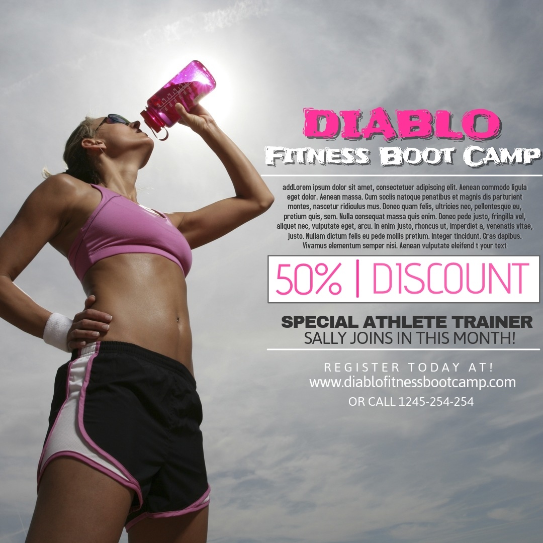
This approach works well for promoting webinars, live events, conferences and more. Here is a customizable, downloadable template that you can use to do something similar. Or browse the entire gallery of fitness poster templates.
The above promo-savvy brands and individuals represent just a few of the many ways to use visuals for different types of social promotions.
Creating custom graphics is no longer the expert task it once was. It’s easy! Fill in the gaps of your social calendar and support your social promotions with custom, professional graphics using PosterMyWall.


