Promoting a concert is hefty work, and a large chunk of it is getting your look right. Every band has its own distinct look, and your job is to find and use yours. The colors, layout and imagery you choose for your promotions reflect your music, and your band’s ideals.
Finding that look is not easy, but by no means impossible. You can do this easily with a combination of research, our music poster maker and your own band’s music theme. Read on to learn everything you need to know to make your concert poster.
The perfect concert poster
The first step to success is being crystal clear about your goal. Now this may come off as strange, but what is a concert poster? Better yet, what is the ideal concert poster? Take a few minutes to think about this, and somewhere in the fog is that perfect poster.
While everyone has their own idea about a perfect concert poster, here’s what an ideal concert poster should usually have:
- Complete text information:
- Band name
- All tour dates (schedule)
- Time
- Venue(s)
- Contact info
- Ticket pricing
- Your band’s look that is prevalent in all your promotions.
- Eye-catching, interesting and good quality design.
Research resources
Now that you know what goes in your ideal poster, you’re likely still unsure about the design you’d like to use. Before you find your design voice, research is necessary. Finding and taking inspiration from great designs is the first step to creating a great poster.
Let’s face it, all kinds of art requires some degree of expertise, and while yours will lie in great music, we can help you out with great promotional imagery. Start with finding inspiration. While artists in the past may have looked to nature, architecture or band posters near the music store for inspiration, you have an endless supply of inspiration right beside you. Here are some resources that offer great inspiration for your rock poster:
Look to the stars
Don’t limit yourself to just these websites, but also look around and see what your favorite bands are up to. Their album covers, promo images, flyers and schedules can give you a better idea of the look you’d like to pursue.
Note that most bands follow a specific kind of theme in their visual material. The theme is often associated with:
- Musical genre
- The impression they think they give their listeners
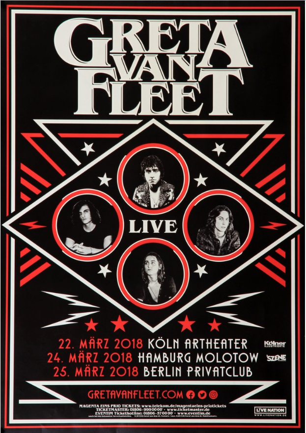
- An overarching theme, that transcends traditional music labels (think Ghost or Greta Van Fleet).
These themes can be about elaborate costumes, anonymity, glamour or rocking an 80’s look with your posters, hair style and music. And there are a thousand other ways to express yourself via these mediums whilst being unique about it. Yours could be one of them.
Here we’ll look at two bands that truly do a great job with their visuals consistently across their albums and promotional material.
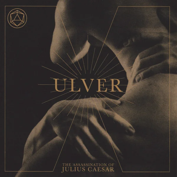
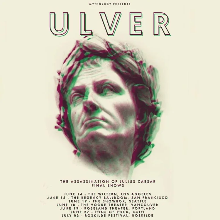
First up, Ulver is an experimental musical collective, with a knack for dabbling in all kinds of music styles, starting from a folky, black metal style to finding a place with rock, ambient and even dance music.
Their divergent ideals, and preference for dark ambient and electronic music styles are present in their album cover, and promotional content.
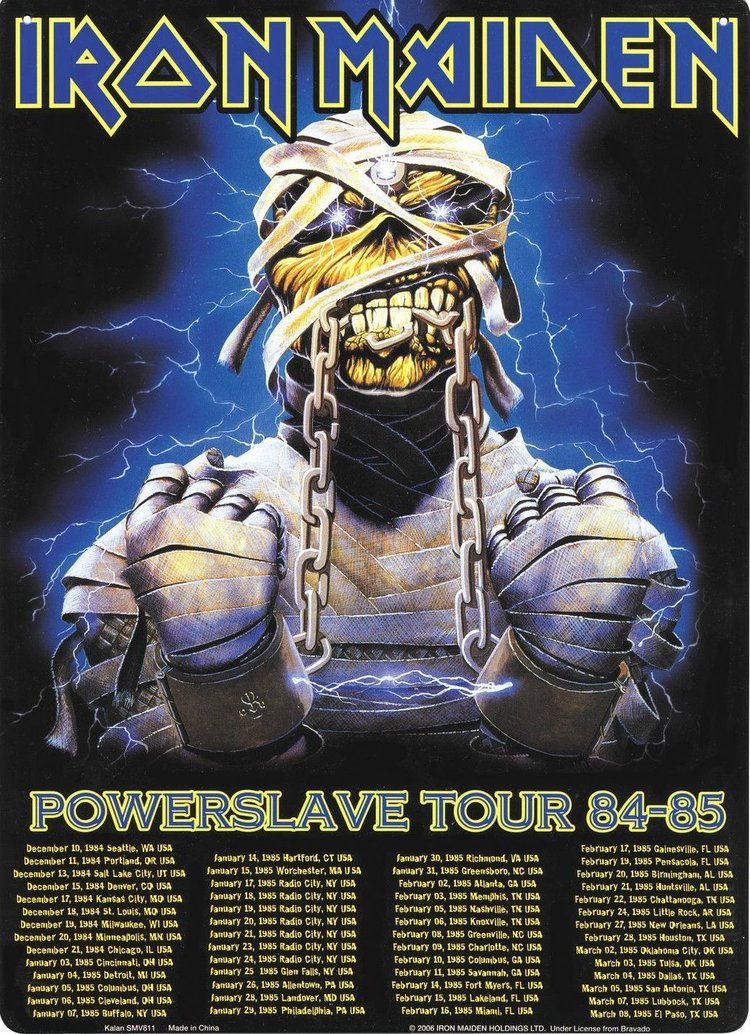
Another band that does even a better job at defining and using their look to set a name for itself is Iron Maiden. Sure, their artwork is not the reason behind their success, but a simple design choice as adding a mascot to their album covers has made the protagonist of this cover, ‘Eddie the Head’ an iconic figure. See how the mascot was used in their concert promotional poster:
The difference in visual choices between the bands Ulver and Iron Maiden are vast, and that’s because they’re completely different bands, with different artistic ideas, instruments, ideals and goals. See what your favorite bands are up to, and try to emulate, or conjure your own style.
Next we’ll have a closer look at design aesthetics, based on music genre.
Understand the layout
Every music genre has its own ‘standard’ when it comes to album and poster design. Their album design influences every other visual they create. If you sift through all the promotional material you can find from all kinds of artists, you tend to find common denominators, based (loosely) on the genres.
Use this understanding in album design to help you create better posters and promotions, based on your musical territory. The following list is not final edict for your design choices, but simply observable differences in aesthetics based on music genres:
- Pop
- The main singer is center focus, and the layout is based around that.
- Natural colors, tilted slightly towards warmer colors.
- Concert posters have the artist in focus, which is especially the case if the artist is famous. But this works for everyone, regardless of fame. Use makeup and image editing for a good shot.
- Examples: Lana Del Ray, Taylor Swift and Florence and the Machine
- Punk
- Bright, often contrasting colors. Harsher visuals.
- Mixed mediums often used, such as a face with crayon crosses on their eyes.
- Some oddities use simplicity, such as a simple visual over a sandpaper texture.
- Concert posters sport strange (often edgy) illustrations, cut up landscapes inspired from dadaist art with airbrushed fonts.
- Examples: Blink-182, Swans, New Found Glory and Green Day.
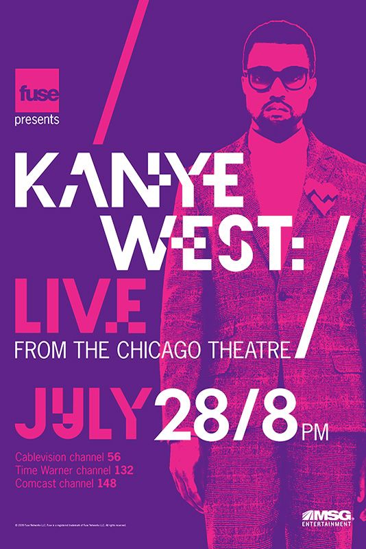
- Hip-hop
- Like pop, the artist is center focus, with the album title on the side. Rougher around the edges.
- Mix mediums with high text content, with a photo on the side (think ‘Life of Pablo’)
- Some artists use photography to inspire and create a theme around social change, such as a picture of an unruly crowd or a van.
- Concert posters for live events that show popular artist(s) in the front is a great hook for attendees.
- Examples: J Cole, Kanye West and Kendrick Lamar.
- Rock
- Rock is a broad generalization, with a large variety of music falling into this category.
- If you’re going old school, take a photo with your band mates and add some textures.
- Illustrations are in with newer acts. Take an illustration, add your album and band name and you’re all done.
- Rock posters often sport illustrations as a backdrop to their schedules, or if they’re a solo act, pictures of their own band.
- Examples: Muse, Deep Purple, Poets of the Fall, Mastodon.
Try your hand
You should have a good library of references by now, and it’s time for the next stage. Designing your poster is easy with the PosterMyWall editor, as you’ll find templates for all kinds of genres and sizes – saving you a lot of time and hassle as you don’t have to create the design from scratch. It’s already been designed for you, by professionals. Get started by browsing the following categories:
- Concert poster templates
- Open Mic poster templates
- Album cover templates
- Live music poster templates
- Vintage concert poster templates
- Retro posters


Text content matters
We’ve spent some time looking at great layouts, but that shouldn’t distract you from the poster’s actual goal; relaying information. The information present on your poster should be complete, and should be placed so that necessary details come into focus.
The concert schedule should be prominent, followed by contact details, including social media and contact numbers and lastly, pricing. Normally, your poster will be viewed from top to bottom, left to right, so make sure important information is displayed with this order in mind.
Give something tangible
Your poster or flyer isn’t the only advertisement your audience will come across. They will have to sift through hundreds of advertisements, in their phone, laptop, across billboards and walls, all contesting for their attention. Which is why, they may come across your flyer, scan through and forget about it a few seconds later, as is the case for hundreds of other advertisements.
Giving your audience something tangible, such as a contact number, date and time for your event, which they can take home can give you an edge, like no other, and that’s where tear-off tabs come in.
To add tear-off tabs, go to the PosterMyWall editor, click Layout > Add Tear-off tabs. With the options on the right side of the editor, you can change the number of tabs, text content, colors. Tear-off tabs can be dragged and dropped, and resized according to your canvas size.
Wrapping up
We’ve discussed how you can easily create a great looking concert poster without relying on a graphic designer and still rock your marketing game. We discussed:
- Contemplating your perfect poster.
- Researching online for all kinds of ideas.
- Looking to others in your music sphere for inspiration.
- The importance of a layout that compliments your music genre.
- Starting the design process with PosterMyWall’s concert poster templates.
- Text content and how you can use it.
- Tear-off tabs and how they form as memory glue for your posters/flyers.
If you found this article useful, you can read up Why defining your band’s visual aesthetic is crucial. For additional music marketing tips, learn from a music marketing expert.
If you’re new to designing visuals, promotions, and album covers, try PosterMyWall for an easy and effortless design experience. With the ease of design, you can also experiment with your next album visuals, like trying out a new wave album cover for your next release.
Qasim is a senior editor at PosterMyWall. Qasim is a reader and writer during and after work, and likes to explore a wide range of topics and niches. Outside of work, he likes to meditate, listen to good music and journal.