Supercharge Your Church Marketing - A class with PosterMyWall
This week, our live class focused on marketing tools and best practices for church marketers—especially social media and promoting video replays. Presented by special guest Camille Jamerson, CEO and brand communications consultant at CDJ & Associates, we got to see a sampling of the excellent marketing Camille’s agency creates for its church marketer clients.
If you missed the class, you can watch the replay below. Or, if you prefer the highlights only version, read on for a summary of Camille Jamerson’s presentation.
8 creative ways to take your church marketing to the next level
Camille Jamerson, who’s been a “church girl” her whole life, is passionate about church marketing. She explained that good marketing is key to communicating with congregants and potential congregants. “You want to inform, educate and engage your congregation in new and creative ways and inspire new seekers to consider your ministry as their church home. And you want to do it in a way that expresses what you believe and what your ministry has to offer,” Camille said.
To help, Camille shared 8 creative opportunities for ministries to communicate with their audiences.
Informational graphics
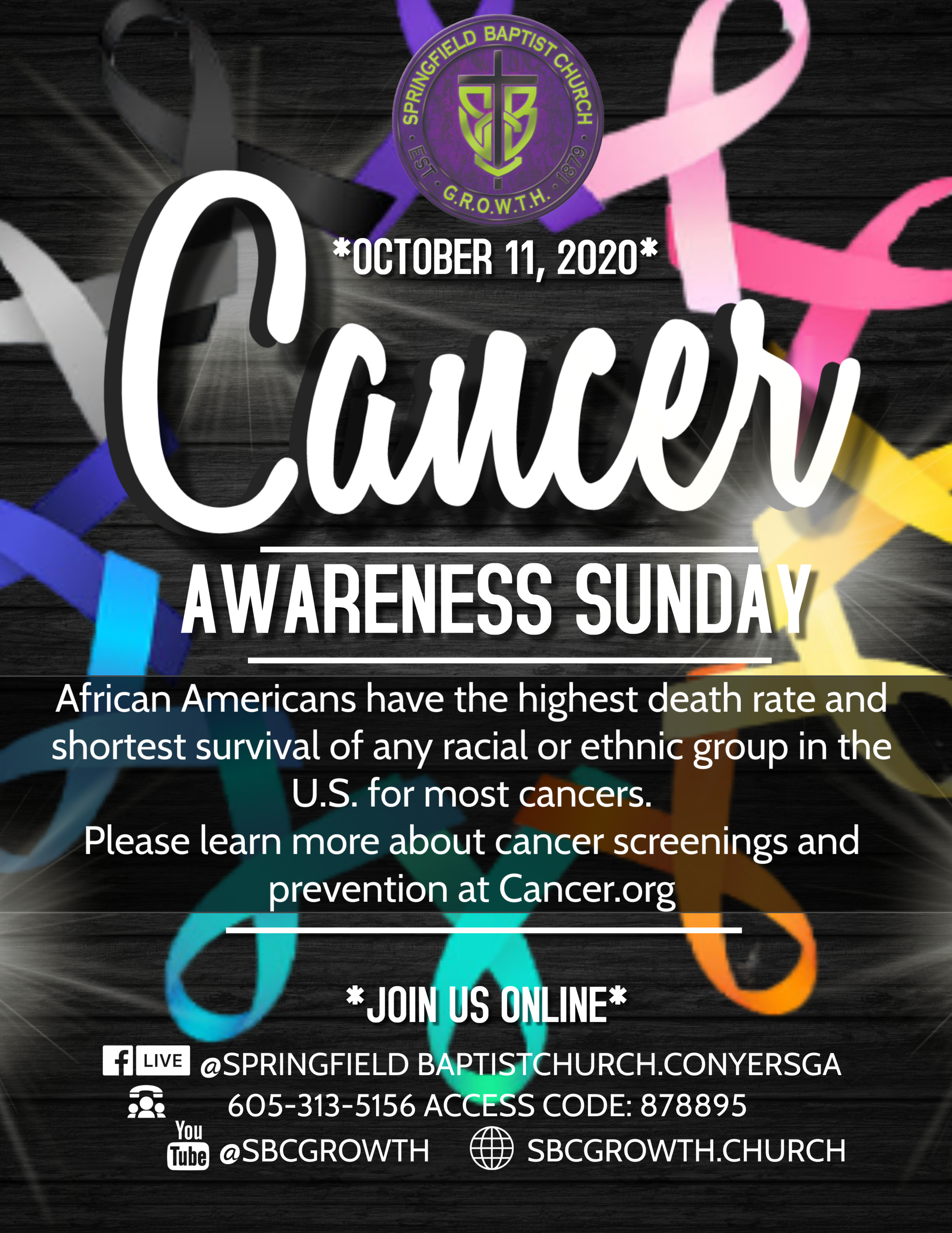
There are literally dozens of types of messages that can benefit from being communicated via an informational graphic. Giving and volunteer opportunities, worship schedules, special events, key issues, and more…
Camille’s point was that we all have a lot of information to communicate—and that by doing it via good looking graphics reinforces your church’s brand and makes the message that much more memorable.
Camille recommended projecting informational graphics during worship, putting them on fliers, sharing them on social media and even printing them on postcards to get your messages noticed.
Pro-user tips: Get more mileage from each graphic by repurposing it and delivering via multiple channels. Use PosterMyWall’s one-click resize button to adjust the graphic’s dimensions and then just drag and drop your elements into place and you’re ready to rock.
Thumbnails for video replays
We all want our congregants and potential congregants to take advantage of the sermons, events and other content we’ve been posting on YouTube. And what is the #1 thing that entices you to click on a particular YouTube video? The thumbnail image!
Camille said the correct video thumbnail design will communicate what the video is about and the tone of the presentation. By using consistent fonts and colors, your brand will be consistently integrated into every image. When there are multiple videos in a series, a consistent look and feel will help people identify where to click to view the next video in the series.
When promoting the replay of an event, Camille advised it is best to use the same graphics for the video thumbnail as you did in the event promotion. That way, people recognize the graphic and know that this is the video for that particular event.
Mailer or postcard graphics
“People still like to get mail,” Camille said. Whether your mailer is promoting an event or holiday—or just to ask “how are you doing?” people are happy to find something well-designed and with a message they appreciate in their mailbox.
Camille recommended that you work with your printer to develop a template that leaves enough room for the address and mailing information. Once you set this up once, you can update and re-use the same template over and over.
Email graphics
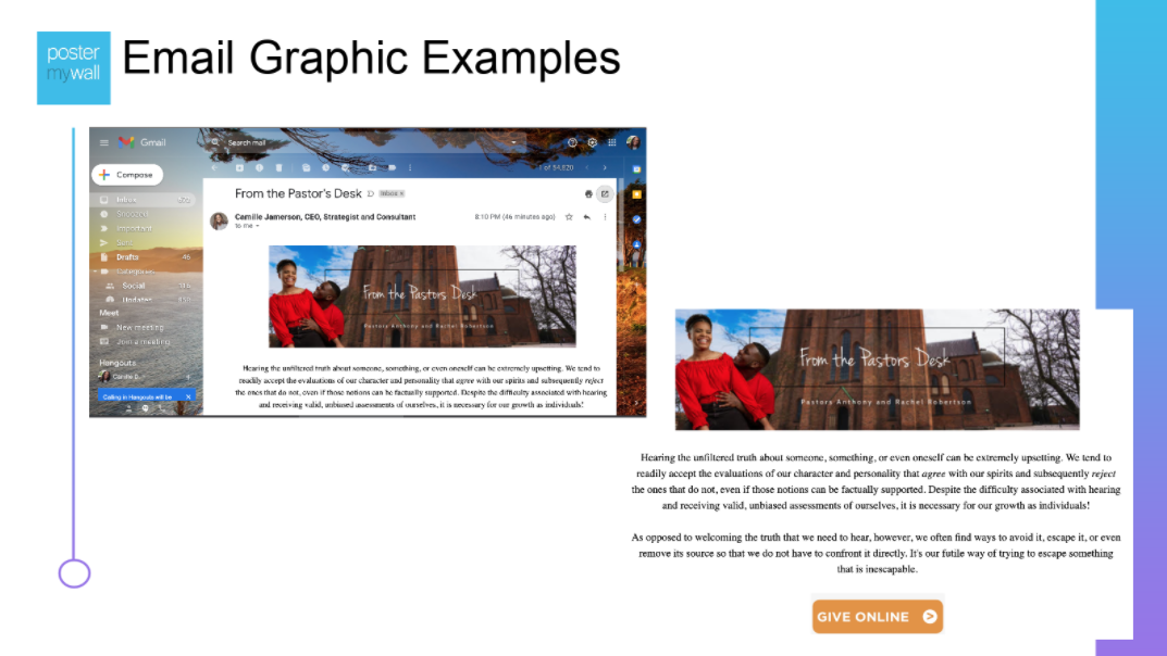
The right graphic can make your emails feel warmer and more personal. Camille suggested that you stay on brand and possibly integrate photos of your pastor or your church—something people will recognize and relate to.
“The great thing about email is that people forward it to friends and then they forward it too—so it really extends your reach,” Camille said.
Podcast cover graphics
Similar to the video thumbnail, podcast cover graphics set a tone that helps people know what to expect—and helps them quickly identify which episode to listen to first.
This is another opportunity to repurpose and/or reuse. “Once you have that graphic made, use the heck out of it,” Camille said.
For instance, you can also project your podcast cover graphic during warm-up before worship, post it to social media, and drop it into an email newsletter to drive additional listeners.
Holiday graphics
“Never let a holiday go to waste. They’re all great opportunities to reach out to your ministry,” Camille said. Think beyond Christmas and get creative. For instance, on Valentine’s day, you can add a scripture to a PosterMyWall template and use that to draw attention to your ministry on social media. Or on Veterans Day, post the names of loved ones or congregants who have served in the armed forces.
Even if it’s just a greeting, with creativity and brand-consistent design, holiday graphics can open up a whole new avenue for content and connection.
Conference graphics
Whether your events are in-person or online, great graphics let people know what to expect—and get them excited to attend.
Video graphics
Camille said that one of the secrets to standing out online is to use movement to draw extra attention. How does she accomplish this? By using video backgrounds.
With PosterMyWall, it’s easy to add a stock video background to any template, then adjust the opacity to make the video as strong or subtle as you like. Camille suggests using this approach to draw extra attention to new offerings—or to give ongoing events like communion Sunday a fresh feel.
Throughout the presentation, Camille referenced PosterMyWall—which she uses to create many of her graphics. “So many times PosterMyWall has done the work for me and all I have to do is change the copy, colors and images—so I have my completed graphic in just five or ten minutes,” Camille said.
Ready to start preparing all kinds of communication media for your congregation?


