Top 10 Templates From The Design Community - Vol 4
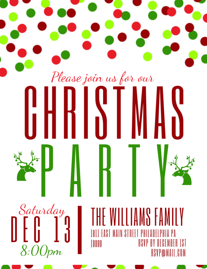
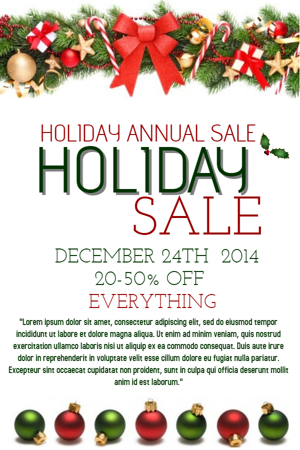
The holiday season is here and we’re excited to see all the amazing Christmas themed templates created by the design community. Customers loved them too, as is evident from the top 10 list below.
In this article, we will highlight many Christmas templates as well as others that were customized frequently in November. Let’s get started shall we?
White Layouts For Flexible Design Options
Designed by Renee Nicole. These templates rule because they have a very simple layout, and one can go in any direction when customizing them. Excellent flyer and poster designs!
Black Layouts Work Just As Well
Of course you can go the complete opposite direction, by picking black over green and the results are still striking. Good usage of clipart also strengthens this template’s design. You can find clipart by going to Clipart → Add Clipart, and then search! From Designs by Katina.
Add Humor
Adding a little humor can create an excellent impression for your event. If your mediocre flyer can make people smile, you’re more likely to score a conversion rather than with a perfectly designed flyer which lacks personality. Designed by Renee Nicole.
Grab Attention with Contrasting Colors
Always highlight your call to action with a variety of techniques. You can try contrasting colors, such as red and white over a blue layout.If it’s for a good cause, people are more likely to take notice and come.
Poster template by Designs by Katina.
Backgrounds are Important
A good background can do wonders for your flyer. It depicts professionalism, and promises a return on the time the user spends customizing it. The simple layout allows for quick customizations. All you need to do is change the text and you’re done! Designed by Renee Nicole.
Use Clipart
Here’s one of our most popular thanksgiving poster templates and for good reason too! The cute turkey picture instantly informs the viewer that the flyer is about Thanksgiving before actually reading the text. Designed by the talented Ana Silvia.
The Power of Good Clipart Use
At first glance, this looks like a complex designed poster, but in reality, it all started with a blank blue layout. Then text, images, clipart and a border was added and voila!
Adding borders in your design is easy. Just go to Clipart → Add Shape and then select the rectangle. Expand it to encompass the poster, and change it’s opacity to 0.
Designed by Renee Nicole.
Big Image
Perfect design which doubles as a great movie poster, and even as beauty salon poster. Notice the great use of fonts here. Designed by Sirle Kabenen.
The Corporate Look
Doing a hiring run, or advertising your firm? This is the design to use! It has a call of action at the top, a brief introduction of the personnel at the bottom and the space for the mission statement in the center. Design by Cantabile.
And this concludes November’s list of top 10 templates. You can also join the design community, to create and sell awesome design templates.
Give us your feedback on social media! We are on Facebook, Pinterest, Instagram and Twitter.


