Top 10 Templates From The Design Community - Vol 6
The new year is well underway, and it’s hard to believe January has already gone! So, let’s recap! While January can be a “lazy” month, with everyone reeling from the Christmas and New Year’s festivities, our designers cooked up some great designs, and even more customizations were created. Let’s look at some of the most popular designs of this month.
New Year Resolutions!
When one of the most popular New Year’s Resolutions is to get fit, it’s not surprising that fitness centers would speed up marketing drives. Fitness flyers were a big hit in January!
A Sports Poster
A clean design with a clear layout. It has been customized frequently because of the amount of flexibility it offers. Its simple text and sample image allows the user to completely customize the design according to their needs. Suddenly, you go from Hockey poster to Restaurant Flyer! Voilà!
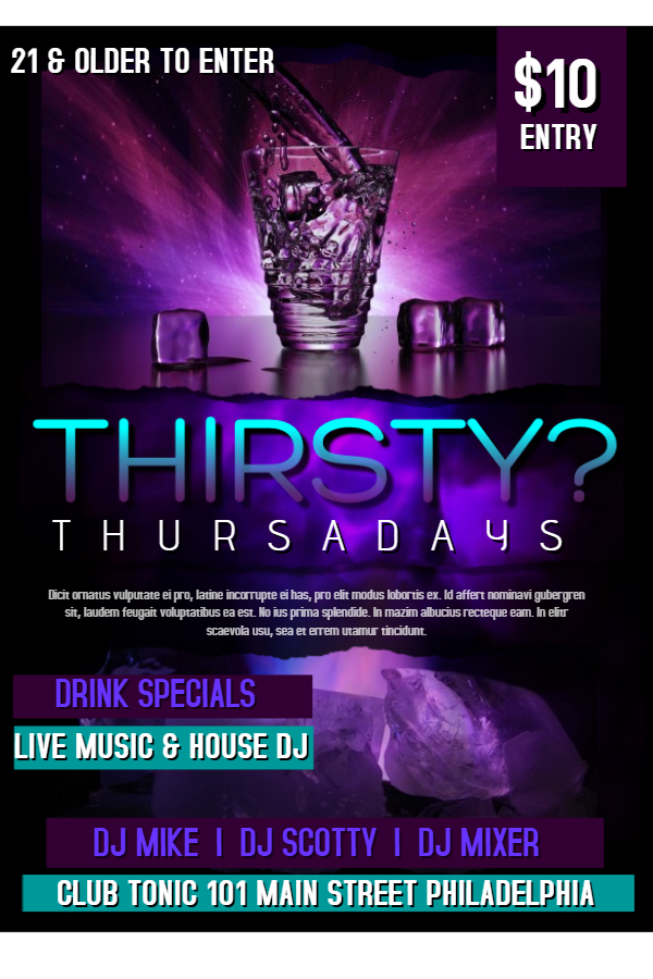
Vibrant Nightclub Flyer
Do you have a party coming up? Here are a few tips for making a visually stunning flyer:
- Use bright colors that compliment each other. Adobe can help.
- Use attractive images.
- Or use the above template and customize as you wish.
Your Free Lancer Resume
If you freelance and need to advertise your services, you’ll want to target a larger and local audience using flyers. Use the above design, and many similar designs, at PosterMyWall to get your head in the game. It can be like your little resume, so potential clients have no confusion when seeking your service.
Talent Show Poster
To make your event a success, a great amount of time is spent spreading word about it. Social media content and flyers are equally necessary. This simple yet effective template displays all the important information clearly, while using great imagery, to make it’s purpose clear at a mere glance.
Nightclub Poster With All The Right Shades
We talked about complimentary colors, but what if you pick different shades of the same color? The results can turn up pretty astonishing if done right! The Poster Maker also helps you out when deciding which color shades to implement.
Shapes and Edge
Shapes and edge effects are among those little effects that can change your poster from meh to amazing! Use edge effects to make images circular, and use borders to add a white border around them. Shapes, such as lines and triangles, can add variety to an otherwise dull background.
Valentine’s Poster # 1
Valentine’s Day is a couple of weeks away, with event and retail preparations in full throttle. Use only 3 colors, as seen in this very striking poster design, for excellent results. It will surely make heads turn.
Valentine’s Poster # 2
Use the Fancy Text feature to make your text compliment with the background as above. It’s easy to recreate just by using a good background, and adding plain text and fancy text.
Valentine’s Poster # 3
Last but not least, another Valentine’s Day Poster to use for your upcoming event. Add images, use clipart, and have fun with designing your posters. The results will be better than you expect!
And this concludes January’s list of top 10 templates. You can also join the design community, to create and sell awesome design templates.
We also started the PosterMyWall Premium subscription. It is loaded with benefits, including unlimited high res downloads, for just over $8 per month.
Give us your feedback on social media! We are on Facebook, Pinterest, Instagram and Twitter.


